In the competitive digital world of 2025, acquiring customers is not about flashy ads or viral content, it’s about leveraging the right tools to discover, engage and convert people who have an existing interest in your offer. The marketing has evolved. Now, the customer journey is data led, personalized, and is spread wider across platforms than it has ever been before. To reach new customers, businesses need integrated and powerful marketing tools to make this journey smooth, engaging and measurable.
If you’re still relying on age-old marketing techniques and manual workflows, you are missing a great opportunity for conversions. In this blog, we will provide you with a step-by-step approach to improve your customer acquisition using some of the hottest marketing tools on the market from 2025. From lead generation, form tracking, automation and analytics — these tools have changed the game.
First, let’s explore why traditional methods don’t cut it anymore. Consumers are more educated, more skeptical, and can now find multiple ways to make purchase decisions. This means that every interaction, every click, and every form submission must be optimized. It is no longer enough to rely just on organic reach, word-of-mouth or just intuition. It’s paramount to make data-related decisions, automate follow-ups and meet customers where they are. This is really where marketing tools come into play.
The key to expanding your customer base is finding the right audience at the right time with the right message, while being selective of the tools you choose to help in being effective and consistent when attracting new customers. As a startup founder, solopreneur, or part of a growing marketing team, you can pay for stacks of marketing tools that can get you measurable results without breaking the bank.
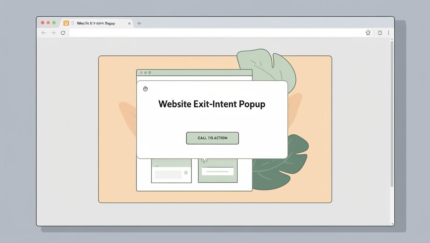
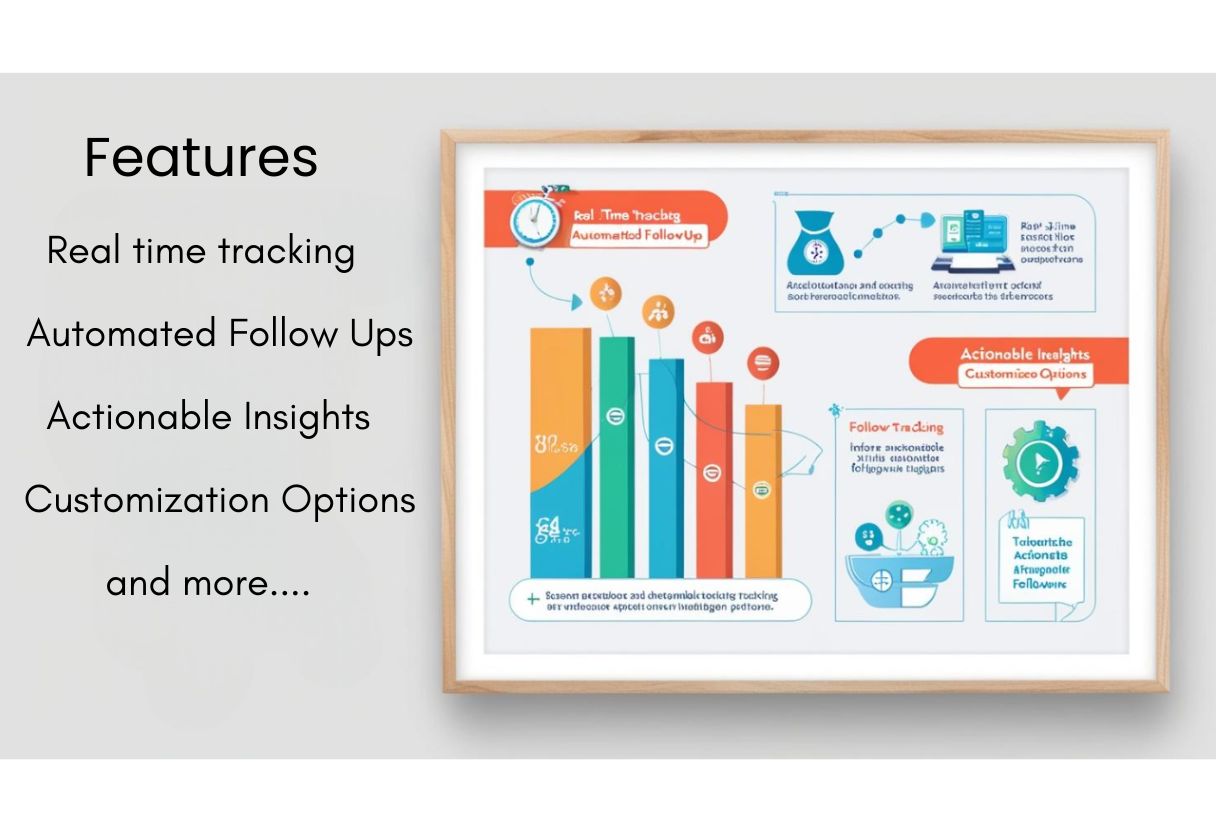
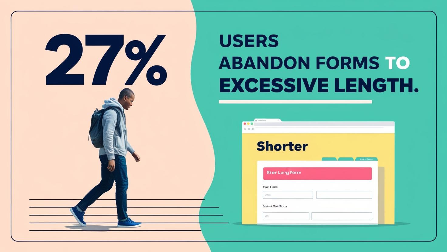
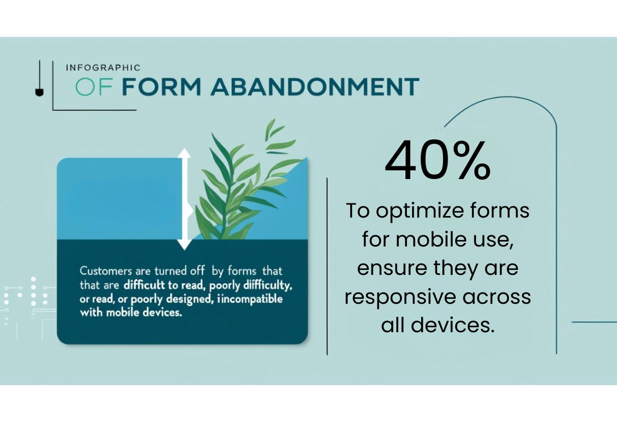
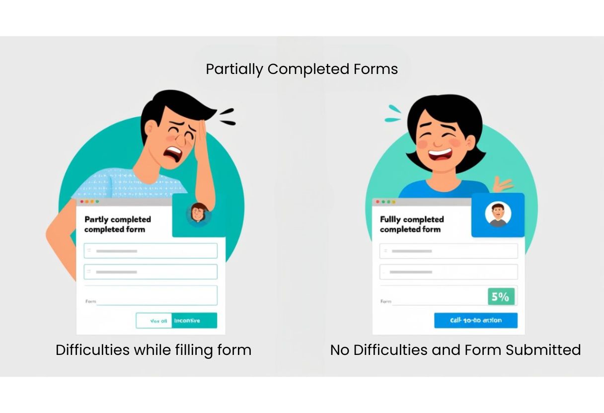
Lets with one of the most important pieces of customer acquisition: Capturing leads who are showing interest but haven’t yet converted. Tools like Trakg come into play. Businesses can use Trakg, a form monitoring and lead recovery technology, to recover incomplete form inputs. In layman’s terms, it tracks whether a user started to fill out a sign-up form or inquiry form and then stopped or abandoned the form. Instead of letting that lead go cold, Trakg saves the partial data and automatically follows up via email or SMS. This drives completion rates up, and converts leads that would be lost forever.
When most people think of ways to gain customers, they will be quick to recommend engaging and utilizing email marketing platforms like Mailchimp or Klaviyo. There is so much value in an email marketing tool for simple list building, audience segmentation, and automated targeted email sends based on user engagement and feedback. Say for example someone clicks to view your pricing page, but does not proceed, you would have the ability to set up an automated email to send to explore further, tell the person more about your service, or potentially offer a time-sensitive discount or offer if they sign up.
Personalization is the best thing about email marketing in 2025. Sophisticated email marketing tools, enable you to dynamically change your subject line, email content, and call-to-action buttons based on whom the recipient is. Customizing emails boosts interaction and, in turn, dialogue.
Making landing pages like Unbounce or Webflow is another crucial process. A high converting landing page can often be the difference for someone to either not return or convert and become a valuable customer. Landing page builders (specifically those with CRO features) can also provide you with pre-optimized templates and A/B testing features. They also offer more versatile integrations with CRMs to help you easily and efficiently set up pages that convert. The sooner you can build, test and optimize these pages, the sooner you will see the results.
Now, let’s talk about some SEO tools because what’s a landing page if no one found it? Tools such as Ahrefs and SEMrush help you learn about what your audience is looking for, what keywords you can actually rank for, as well as who you are up against. The tools give you even more depth on items like, search volume, backlink opportunities, and on-page SEO performance. When you consistently publish optimized content based on keyword research, you will naturally increase organic traffic. And if you attract traffic, you attract potential customers.
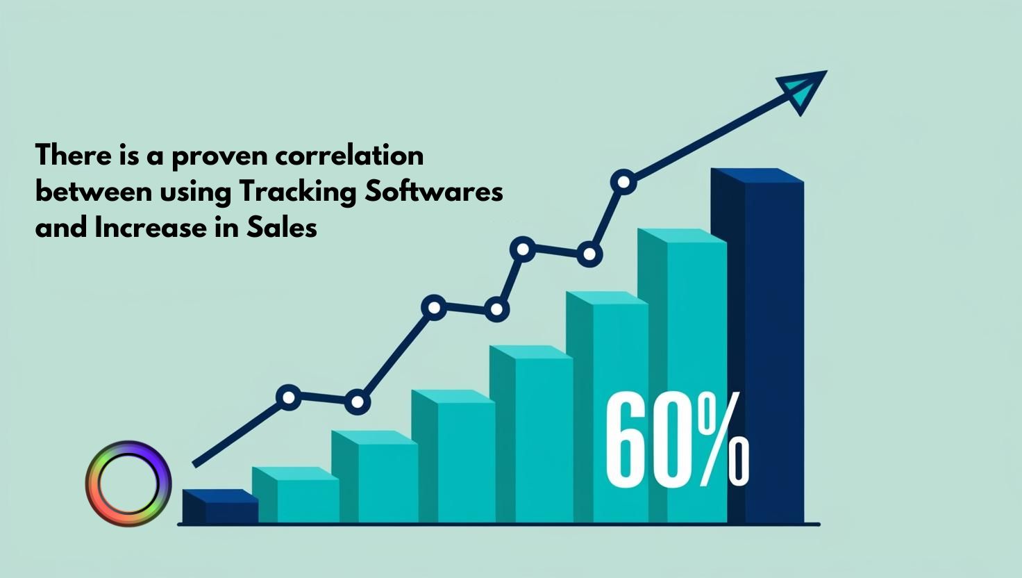
Now, getting visitors is the first part. You must also comprehend their actions on your website. That’s where your analytics and behavior tracking tools come in, like Hotjar or Google Analytics 4. These educational tools will tell you exactly what users are doing on your pages, including where they click, when they drop off from your site, or what they engage in. Through session recordings and heatmaps, you can literally look into the interaction with the users and optimize every touchpoint of their journey. If you see that most people drop off on the price page, then maybe you’re not offering a clear price. If you see that your readers are ignoring your CTA, then possibly, your CTA isn’t compelling enough. These tools tell you what to fix, so you stop losing customers midway.
If you’re managing many channels as a team, social media management tools like Buffer or Hootsuite can help you work faster. These tools allow you to schedule posts, reply to comments, and measure performance, all from a single platform across most major channels like Instagram, Facebook, LinkedIn, Twitter, etc. These tools will also allow you repurposing of content and help you remain consistent across channels with your brand’s tone and voice.
Social media is frequently the best way to engage, develop, and turn followers into paying customers when used wisely.
One more area with lots of potential growth is automation tools like Zapier or n8n. Automation tools help automate repetitive tasks, and provide seamless workflows between many tools. For example, you can automatically send form data from almost any form builder, from Trakg into your CRM, open a channel for Slack to notify your sales team, and initiate a follow-up sequence in Mailchimp – all while never having to write a single line of code. This is what we call “automation nirvana”. Nothing slips through the cracks, and your team can focus on strategic tasks instead of administrative ones.
Chatbots and conversational tools, like Intercom, Tidio, or Drift are also proving to be invaluable in 2025. These tools greet site visitors, answer common questions, capture contact information, and schedule demos. Studies show that website visitors are they more likely to convert into leads when they receive immediate answers, and that’s exactly what chatbots provide that without needing human intervention 24/7.
Don’t forget about customer review and reputation tools. There are many sites that allow you to collect and market user-generated reviews, like Trustpilot and Yotpo. This helps establish trust! In 2025, authenticity sells! Customers now look to peer reviews before considering your brand during their purchase process. By showing verified reviews directly on your site, you establish transparency and help eliminate indecision, typically increasing conversion as a result.
Referral marketing tools such as ReferralCandy and PostAffiliate Pro can also help scale a brand exponentially. These tools provide existing customers with rewards for referring their friends and family, which is similar to word-of-mouth. Still, for all the hype of word-of-mouth, promoting products is still really effective and referral tools automate and scale it. Referrals usually result in more devoted new clients with better lifetime values.
When all these various tools are working together, you will experience a highly efficient, customer-oriented marketing engine. But, for this to happen, your data must flow smoothly between platforms. That’s why integration-first platforms such as Segment and Make (formerly Integromat) matter. By merging customer data from several platforms, these systems provide a single collection of truth. These tools assist in tracking every action a user does, such as clicking on a Facebook advertisement, completing a form on your website, or opening an email, ensuring that your marketing campaigns remain coordinated.
Now let’s discuss the big picture. This isn’t simply about layering of tools, but about developing an ecosystem where each tool can serve a purpose and compliment the others. Trakg captures the lead, Mailchimp nurtures, Webflow converts, Ahrefs attracts others like them, and Hotjar helps you optimize the process. This is the synergy that differentiates growing brands from dormant ones.
Performance measurement is now equally important. Tools like Databox or Google Looker Studio will allow you to pull in all of your data into a single dashboard. So you will know your website traffic, ad spend, email open rate, and social engagements. This will enable you to quickly see what is effective. When attempting to determine when to step down or make adjustments, this becomes crucial.
And let’s not forget collaboration and workflow management tools like Asana, Notion, or ClickUp. Marketing teams need a platform to plan campaigns, assign tasks, set deadlines, and report progress. We want the team to work together and get them all working toward the same goal. When marketing teams are organized, the execution process can be much faster and effective, with better results.
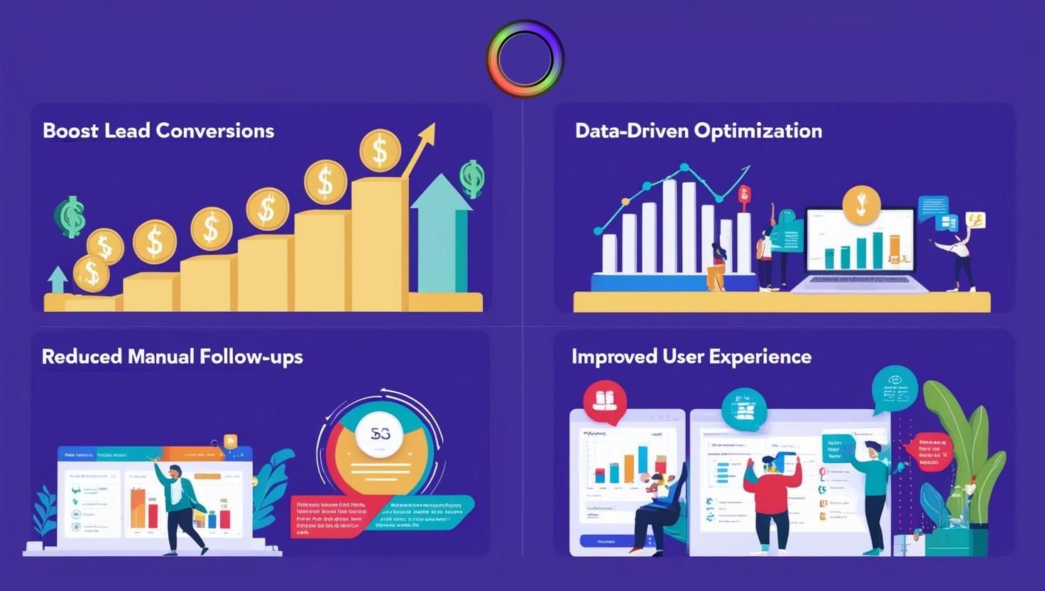
The most significant takeaway is that more customers do not need more, they need smarter. Great tools take unnecessary friction out of your customer journey, make better experiences for users, and turn maybes into yeses. You don’t need 100 tools, you need the right ones, and you need to use them purposefully.
Also, for the year 2025, we are getting deep into the value of AI-enabled tools, and while there are lots that are hitting the market, tools like ChatGPT for content or Pictory for video are allowing teams to get things done faster and smarter. These tools are collaborating with your team rather than working for it. Whether that is writing ad copy or summarizing customer insights, AI will streamline the creative and research sides of the workflow so you can focus on strategy.
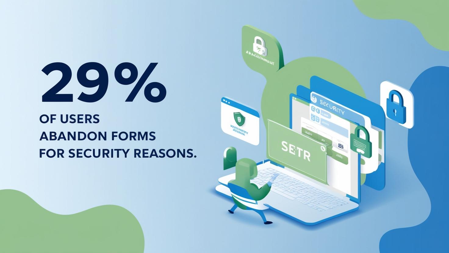
Lastly, let’s take a minute to talk about data privacy and security tools. With GDPR, CCPA, and India’s DPDP rules now in full effect, compliance isn’t an option. Tools like OneTrust or Termly help individuals manage cookie consents, data access requests, and privacy disclosures. Customer trust increases when they feel safe using your data, and trust leads to conversions.
Conclusion: the way to gain more customers in 2025 is to embrace the right tools with clarity and intention. The focus should not be on simply purchasing the newest software or adding unnecessary components. It’s about ensuring those tools provide alignment with your customer journey from attraction to conversion to retention. No matter if you are a solopreneur or managing a growth team, your stack of tools is your key to a competitive advantage.
So ask yourself: Is your stack helping you grow your customer base, or keeping you from growth? If the answer is keeping you from growth, it is time to do a complete overhaul of your stack and use tools that actually create movement.
Because the moment you will realize that more tools do not equal more customers, but the right tools will.
Read More: “Tools Every Marketing Team Will Swear By in 2025”